German precision? Mercedes and a 1956 Leica Summarit.
October 9, 2017
Picking up from the last post, the Leica Summarit was replaced by the Summilux line in 1961. The Leica Summilux is unquestionably one of the greatest lens ever produced with some of the most luxurious renderings ever. Ever! Of course, that luxury is expensive and my Zeiss Sony Planar 50 1.4 gives it a real run for its money at roughly 50% of the price. But that’s not what this post is about.
This post picks back up with additional images from Izzy, my 1956 Leica Summarit 50 1.5. The very interesting renderings of the vintage Summarit are, well… interesting, beautiful, vintage feeling, sometimes wild and sometimes spot-on. Per my last post, one of the criticisms is the lens softness. Wide open, it has a narrow depth of field and is not exceedingly sharp, making it a challenge to use. But the images below challenge some of this traditional thinking. And when it opens to 2.0 and 2.8, you see that it can render sharply in the center of the lens. It is, after all, a Leica. The first subject below is the new Mercedes CLS coupe. Quite sleek and shot at 1.5F. I tried to focus on the word “Mercedes” while my salesman friend entertained me.
And now a crop of the same image… not bad.
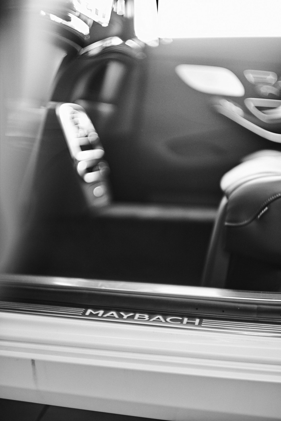
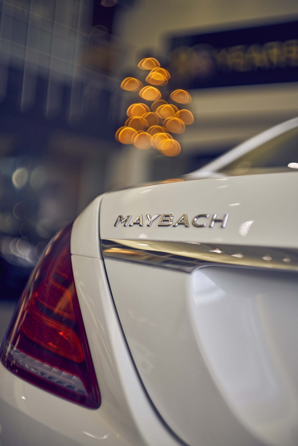
Below are two fun images of a mighty Mercedes Maybach. Both shot wide open. Both rather dreamy. In the color image, the “Y” in Maybach is quite sharp but the letters immediately to the left and right are not. So, back to the point that this lens can be a challenge and if one is shooting clients, one is well advised to use other contemporary or auto-focus lens first or just set the Summarit f-stop to 2.8 first (or all of the above).
Thanks to Loeber Mercedes for a few luxurious subjects (ok, for not throwing me out!). 😉
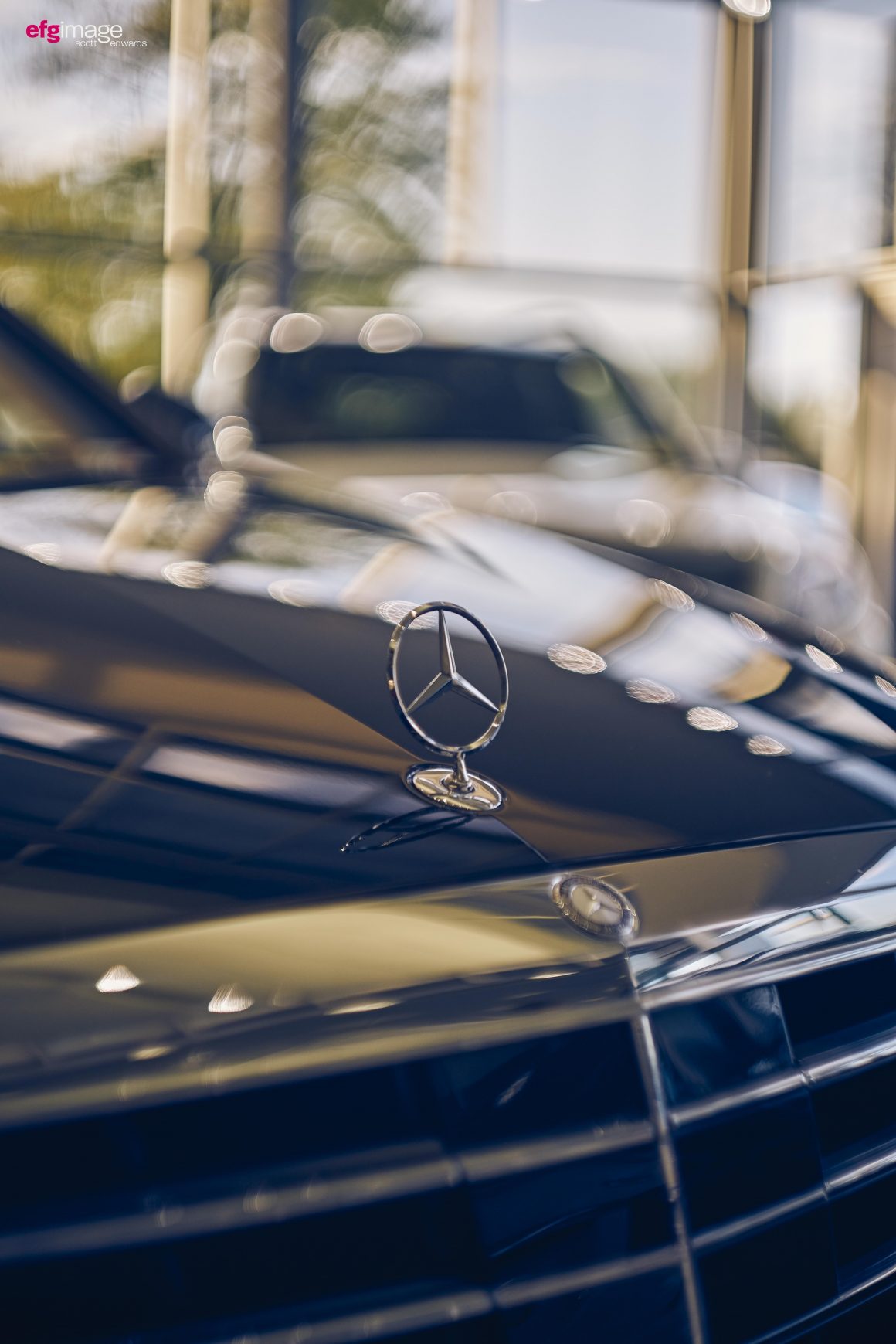
Top row images. The S-class model taken at 1.5, 2.0 and 2.8.
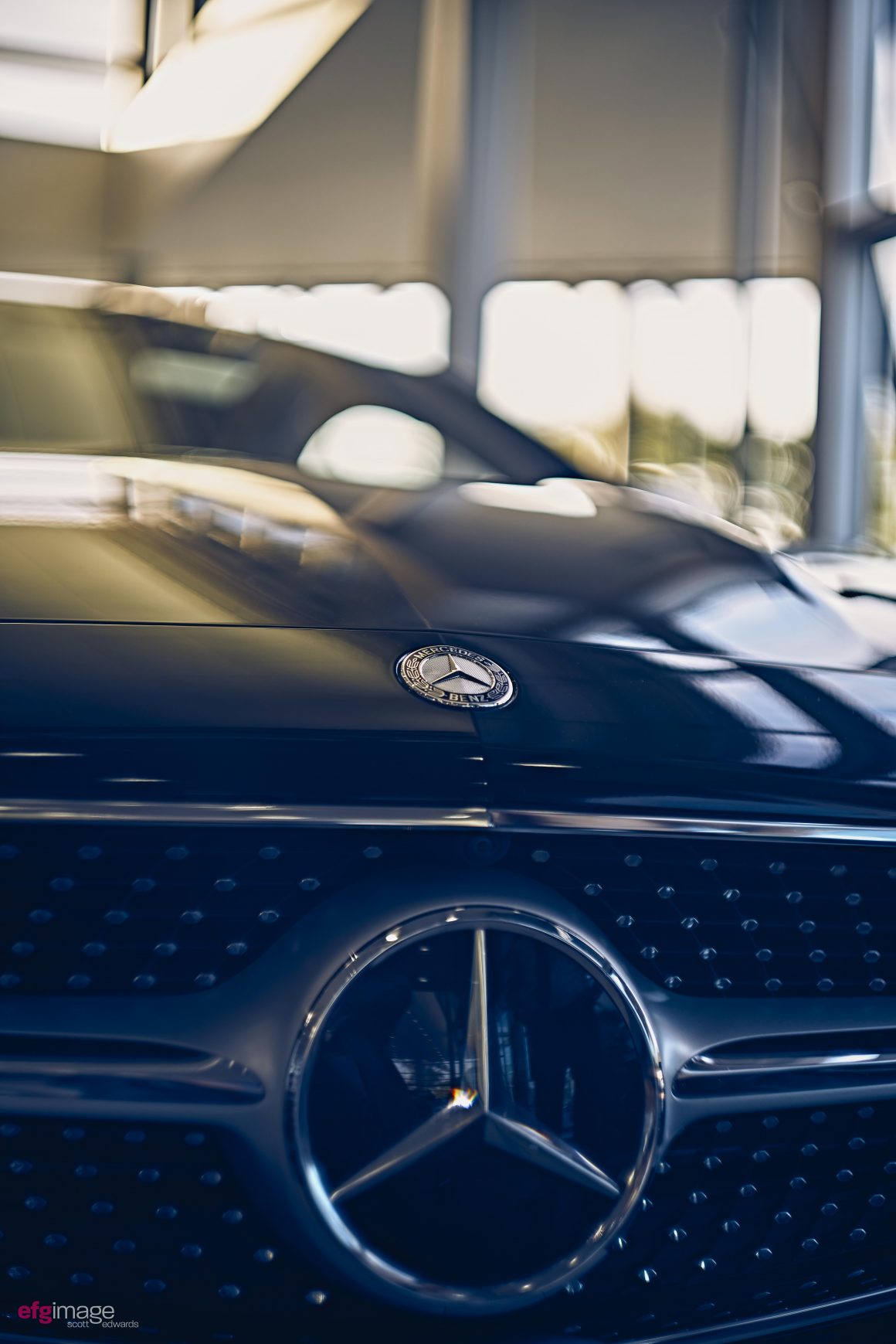
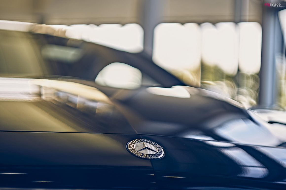
Middle row: A full-blown larger image shot at 1.5. You can see the logo is not super crisp as would be the case with a Summilux. The lens is just darn hard to manage so one has to accept that you’re going to miss shots – thus, one needs to take more.
Bottom row: Image taken at 2.8. Now check out the outstanding sharpness of the logo. To my eye, it looks like a Summicron (one of sharpest lens and a touch more precise than the Summilux). That last shot is more representative of German engineering. Haha…
